Flex Container Properties

Buy ebook

CSS Mine

Get my e-book focusing on CSS3 and
modern web UI development.

Learn more

Block or Inline?

Besides display: flex flexbox container can be defined as an inline element -display: inline-flex. In both cases, all direct descendants become flexbox items.

Flex Direction – Direction of Flexible Items

This property will set the direction of the main flexbox axis.

flex-direction:
  row | row-reverse | 
  column | column-reverse

flex-direction property

The default (row) value will place all flex items in a row. If you want to make a vertically oriented layout, use the column value.

The order of items will correspond to the HTML order. If you want to reverse the order, just use the row-reverse or column-reverse values. This will only affect the visual rendering of the items, not the actual order - i.e., when rendering a site or going through the navigation using tab key. Some of you might have noticed that we can use this property to change the order of list items.

Flex Wrap – Forcing Items to Break

flex-wrap:
  nowrap | wrap | wrap-reverse

flex-wrap property

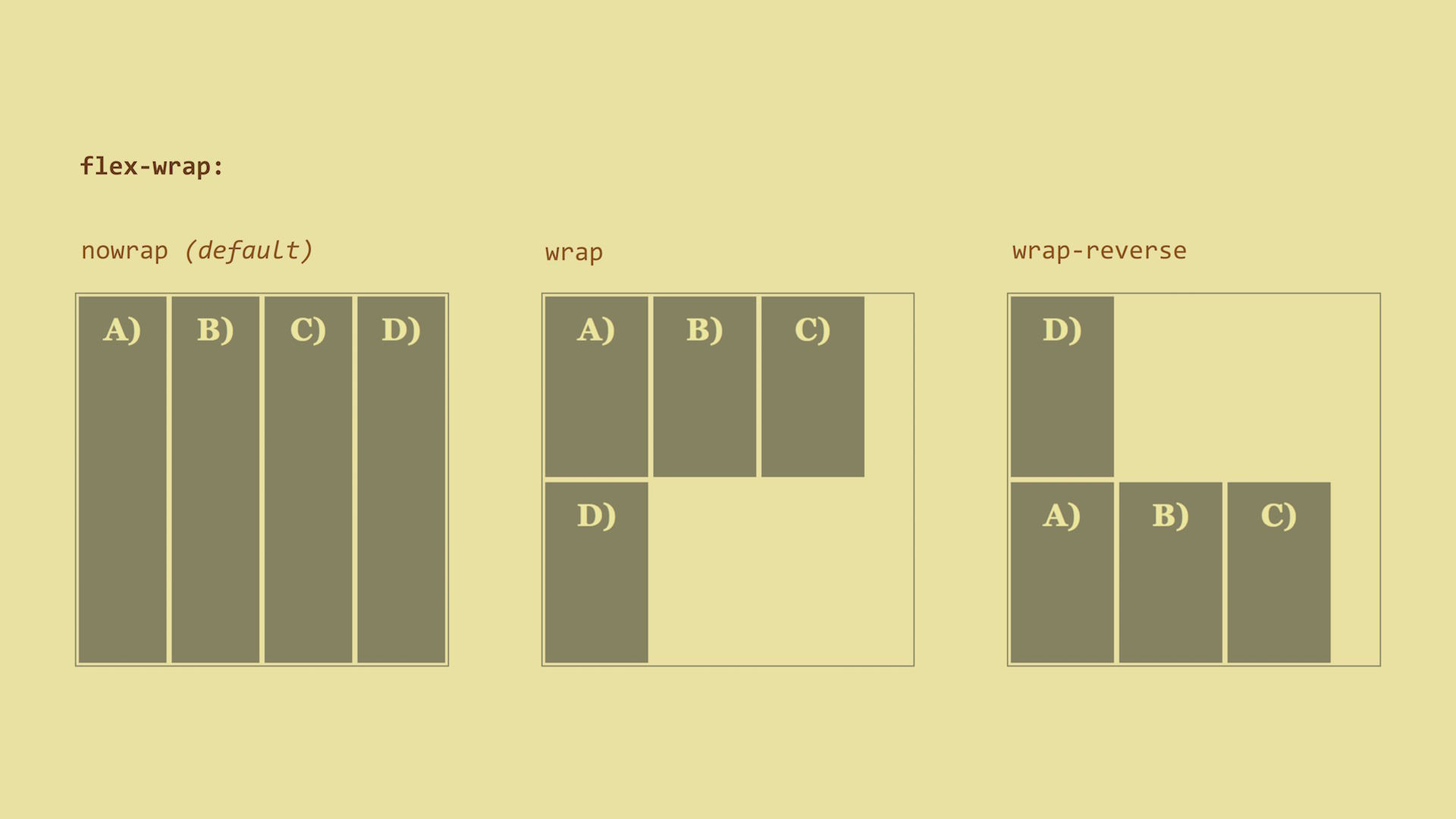
The default nowrap value tells us that all elements will stay on a single line next to each other (or under each other when using flex-direction: column).

Then we have the wrap value. This value will wrap the items onto multiple lines if the items’ content can’t fit onto a single line. The last flex item on the first line will break onto the next line and align under the first item.

The wrap-reverse value does the opposite - the last item will jump onto the previous line and align over the first item.

Live demo: http://cdpn.io/e/mERZxB

Flex Flow - A Shorthand for Flex-direction and Flex-wrap

Let’s explain this in examples:

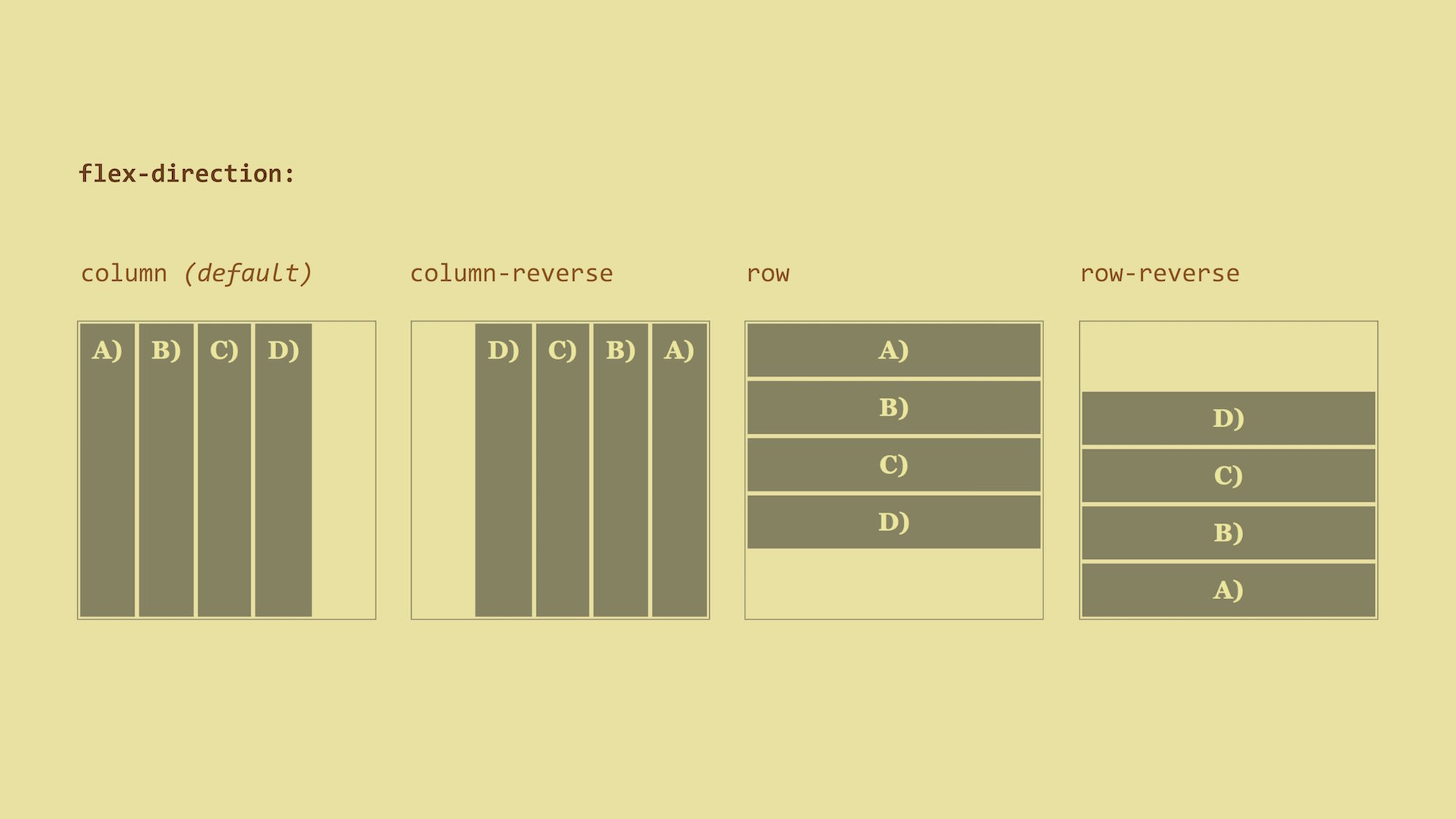
  • flex-flow: row – this is the default value. Items are placed in a single line and do not break.
  • flex-flow: column wrap – items are placed in a column and break.

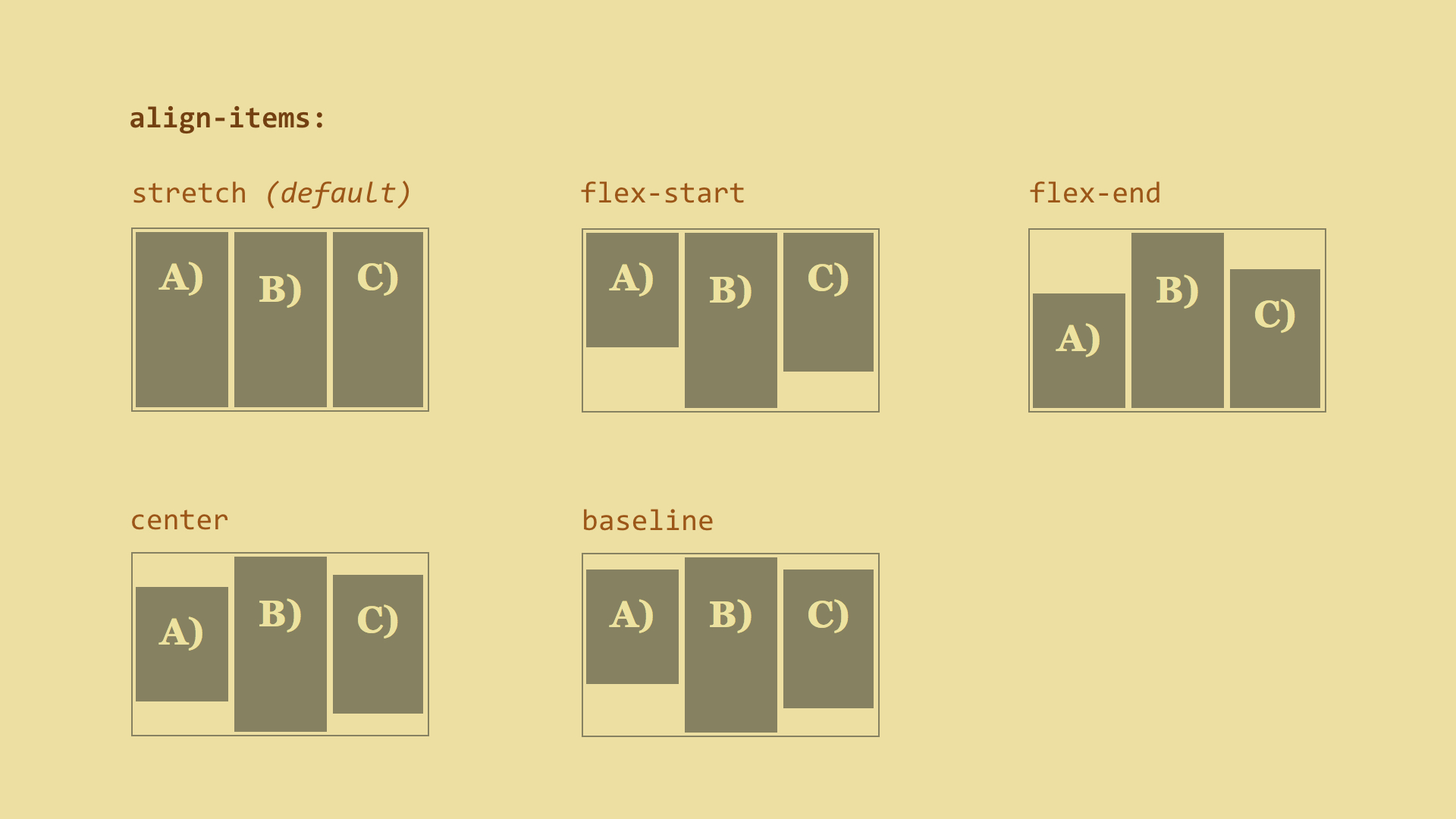
We have explained the flex container properties. Now, let’s explain flex items as there is more to explain.
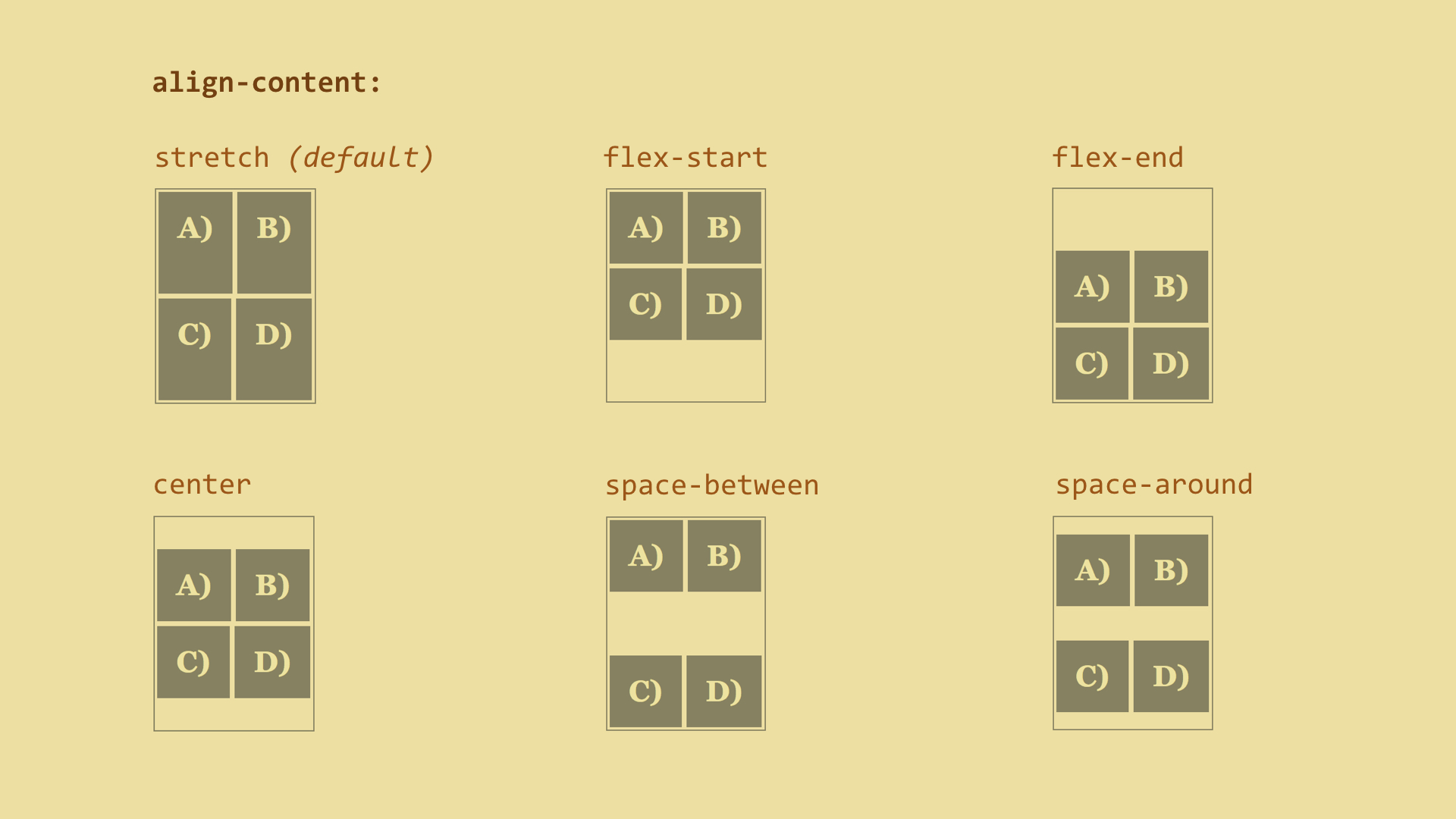
Justify Content – Aligning Main Axis Items

justify-content:
  flex-start | flex-end | center |
  space-between | space-around

justify-content

Let’s apply the justify-content property to the flex container, dictating how flex items will be aligned along the main axis. The default value is flex-start, aligning the items to the start of the main axis.

Live demo: http://cdpn.io/e/doGjaZ

Align Items – Aligning Cross Axis Items

align-items:
  stretch | flex-start | flex-end |
  center | baseline

align-items property

The align-items property can also be applied to the flex container. The default value is stretch which stretches the item to the full width of the cross axis.

Be careful, though! The stretch value will not work if the items size of the cross-axis is defined. In other words, if height is set, it will not work.

Live demo: http://cdpn.io/e/RNmvmr

Align Content – Aligning Main Axis Items Within a Multiple Line Container

align-content:
  stretch | flex-start | flex-end |
  center | space-between | space-around

align-content.jpg

And here is another alignment property. This one applies only to flex containers whose items are wrapped onto multiple lines.

Live demo: http://cdpn.io/e/oXbMRo

So, is all clear now? Ok, now let’s move on to browser support.


Content

Introduction

Introduction

On today’s frontend UI development

UI development transformations

Tools, technologies and workflows

Fallback strategies

CSS3 reference guide

Introduction

Text properties

Background properties

Border properties

Box properties

Media Queries

CSS transforms

CSS animations

CSS3 Layout

Another CSS3 Properties

Non-standard properties

End

End

Buy ebook

CSS Mine

Get my e-book focusing on CSS3 and
modern web UI development.

Learn more